Email industry best practice recommends a 60/40 image-to-text ratio, not even including the text you overlay on images.
What we’d like to challenge you on this week is the way you use those images…
Alternative image placements
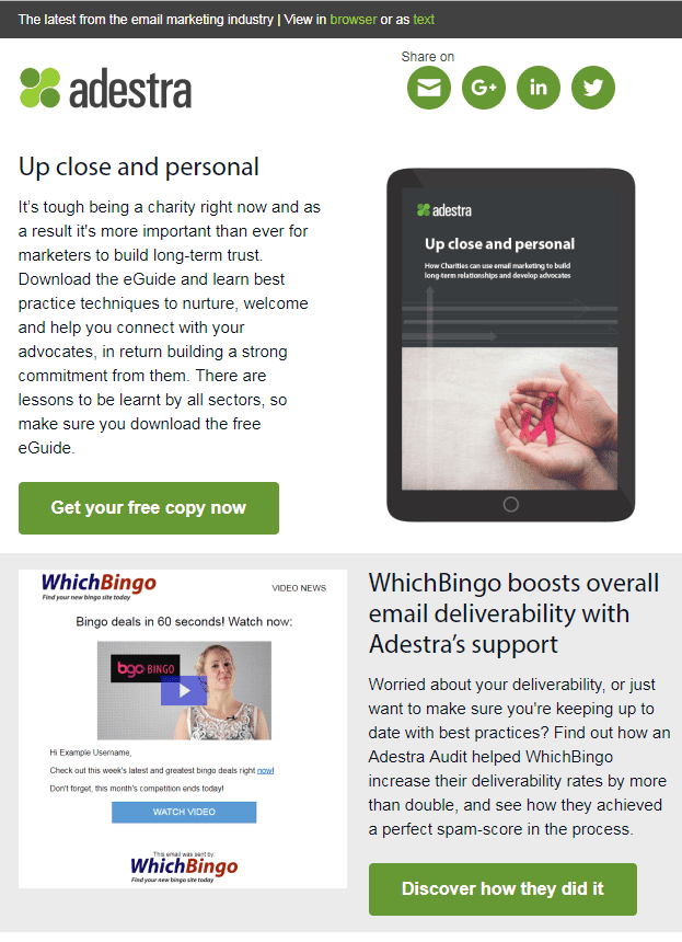
- A layout that has been popular in recent years is alternate images and text like in the example below from our own newsletter.
- You can also try using a Pinterest-board style by leading with the images and using them side-by-side. This is particularly useful if you have a visual business, like fashion or crafts.

- Stack images one under the other if you are conveying points of equal value (think of them as visual bullet points).
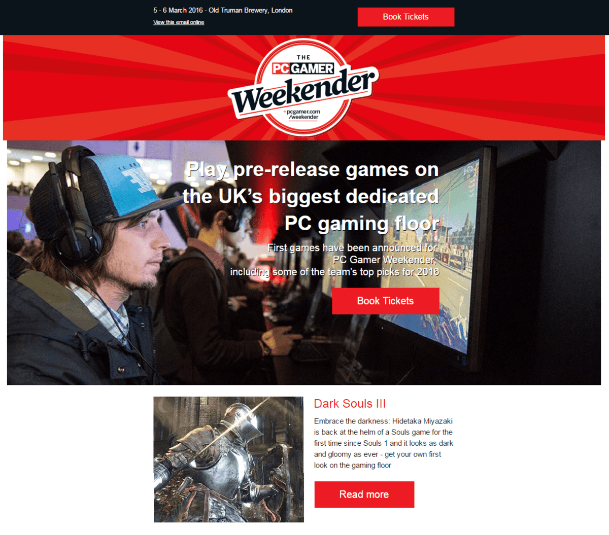
- Use a full-width image header to highlight the most important point of your email (think of it as a banner) and follow with icons with small images, like Future did in this case study.
These are just some ideas, but whenever you decide to test the layout of your email campaign, make sure you have a reason. What are you trying to achieve – more clicks? More conversions? If it’s you’re trying to convince people to download a report, try leading with a full-width image of a chart rather than alternating photos of percentage numbers. More context might lead to more downloads if that’s your goal.
Let us know what and why you tested a particular image placement in the comments below and check our other suggestions too.