
The concept of progressive enhancement has been around in web design for a while. However, it has only been brought to email in the last few years.
In the web world, progressive enhancement is a methodology that consists of establishing a base level of user experience that all browsers will be able to provide when they render a website. This experience will be enhanced by the usage of more advanced functionality that will be available to the browsers that can use it.
So, core webpage content is established first, then layers of enhancement are added in as the user’s browser allows.
In email design
Sounds good, right? But how does progressive enhancement translate into email?
There is a common assumption that most email clients don’t support exciting design, and that an email designer would be better placed using images instead. Nothing could be further from the truth, however.
For a start, overuse of images is not recommended. If your subscriber’s email client disables images, your messaging can be entirely lost, even more so if you’ve been using images to display your text.
Secondly, it is true that some email clients only support basic HTML/CSS and turn their backs on more modern features such as CSS3, HTML5, video or SVG (Outlook, we’re looking at you…).
Your mail goal here is to provide great base experience for those on less advanced email clients, and a truly memorable experience for the rest!
Progressive enhancement in action
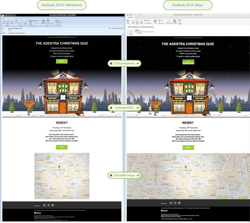
You can see how we applied this concept in our recent Adestra Pub Quiz invitation email. The base experience relies on a great illustration that directs your eye to the main CTA, while the full-width background colors add depth to the experience.
We progressively enhanced the email by adding a layer of nicely animated snowfall and even an array of people waking into the pub. To make the button visible in the dark sky we added a blinking light. The map to find the venue is widened in those email clients that support full-width images. You can see the progressively enhanced email below:
Success metrics for your enhancements
The fact is that implementing progressive enhancement in email improves results. Our clients Kano Computing and Whittard both enjoyed significant improvements in their KPIs through successful use of animation over their base experience.
Design value is often difficult to measure or just not measured at all. In this case, however, you can easily measure design impact in a very granular level. A/B testing is a proven effective tool to measure the success of individual design choices, particularly in email. And it’s here where progressive enhancement can be testing (against success by open rate, brand engagement over time, etc.).
This can help to compare two parameters in a single campaign and check which ones get the best results. You can then implement it across the rest of your campaigns to progressively enhance the experience. You may wish to test variants such as:
- Enhanced buttons vs. basic style buttons
- Animated images vs. static images
- Webfonts vs. web safe fonts
When to use progressive enhancement
Short answer: use it whenever you can!
In particular, progressive enhancement in email can be beneficial in the following situations:
- When you want to provide a consistent brand experience across your channels. It’s common for some brands to reveal a gap in their brand consistency when it comes to email marketing. This is especially true for brands that rely strongly on typography as a differentiating element or web-based companies that rely on the latest web trends to build their brand.
- When you want to surprise and engage. Email is one of the most popular and effective marketing channels, meaning your campaigns face strong competition to stand out in the crowd. Progressive enhancement in email can make all the difference among leading email clients – such as Apple Mail or Apple iPhone – while nevertheless maintaining a good base level experience in other email clients that have limited HTML/CSS support, such as Outlook or Gmail.
In both cases, it’s worth considering who your main audience is and what email clients they use. If most of your subscribers open your emails on mobile or if they are mostly Apple users, go for it! If your subscribers are mostly Outlook users, you might want to consider the effort involved against the value provided by these enhancements.
Here is a brief comparison of the level of support of both clients:
| CSS3 | Web fonts | HTML5 video | Animated GIF | |
|---|---|---|---|---|
| Outlook 2016 (Windows) | NO | NO | NO | NO |
| Outlook 2016 (Mac) | YES | YES | YES | YES |
| iOS (iPhone/iPad) | YES | YES | YES | YES |
Below you can see what this level of support means in an actual campaign:
We live in a world where customers demand memorable brand experiences and seek constant thrill and surprise. If we add the fact that most of the market-leading email clients are constantly evolving to support more advanced features, I can only make one conclusion: progressive enhancement in email is here to stay.