
If you’re a designer, you probably know what ‘whitespace’ is and why it’s important. As an email marketer, however, you may be only vaguely familiar with the term, let me explain why you should care about it when creating your email communications.
What is ‘whitespace’?
Yes, white space – the clue’s in the name! Often referred to as “negative space”, whitespace is the absence of text and images.
Why is it important?
It doesn’t just help you create a more modern design but, more importantly, it also provides breathing space for the reader’s eyes. It creates a well-balanced and harmonious design which moves away from a cluttered layout.
It also helps the other elements of your email to stand out and improves readability and comprehension, as it can guide your reader’s eyes from idea to idea, establishing a consistent reading funnel.
Too much copy and/or images can make your reader feel bored and overwhelmed. (And, I must confess that every time I’ve felt this way about a brand, I’ve stopped opening their emails from a brand or I’ve unsubscribed.).
Some examples: The bad and the good
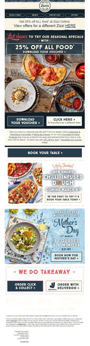
Zizzi
I don’t know what you think, but I think I can guess: too much. I like Zizzi, but I must admit I feel overwhelmed and anxious by all the information, images, and colors within this email. It’s just too much. Every possible bit of whitespace has been filled with more elements. All this clutter is confusing, and the message gets lost.
Battersea Dogs & Cats Home.
A great example of good use of whitespace. When I open an email, I tend to scan it before giving it a focused read and Battersea Dogs & Cats Home are making my life so much easier here. Clear sections with titles that highlight the main point of the section, images that reinforce that information, clear CTA buttons…and space, plenty of space that makes my experience with their email more relaxed.

No matter what your job title is. If you work in email marketing you should know how valuable open rates are (not to mention CTOR). Your subscribers are giving their time up to read your emails, but they are not going to read them if they feel overwhelmed. So, make sure your design helps them to read the information provided, which may help improve your CTOR and conversion rates.
If you’d like to design beautiful emails without knowing a line of code. Speak to the Adestra team today.