
We all want our emails to look beautiful and images play a key part in this.
They say a picture is worth a 1000 words, but if the email client of your subscriber disables images, your message can get lost with them. This is an even bigger problem if you’ve used images to display text.
Can an email still look beautiful without losing that all important message? Yes, if we design and build our emails to not only look great, but also maintain their purpose. It’s about finding that balance: where beauty meets functionality.
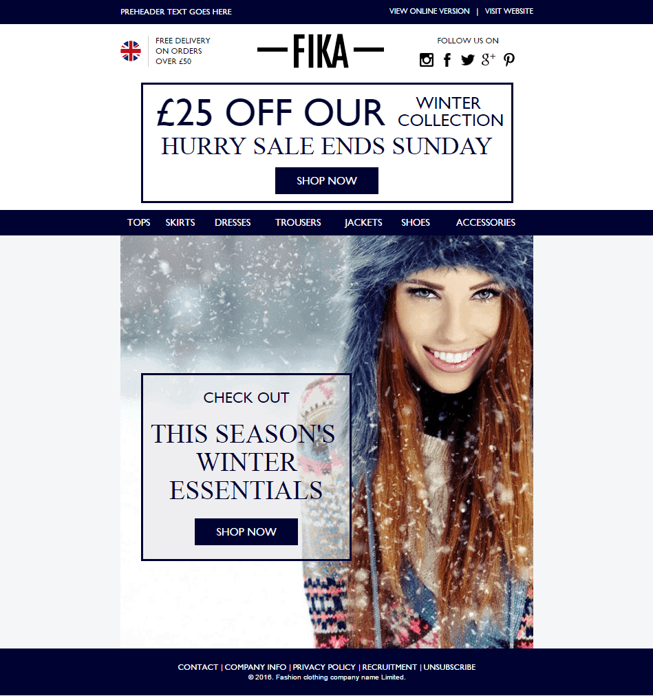
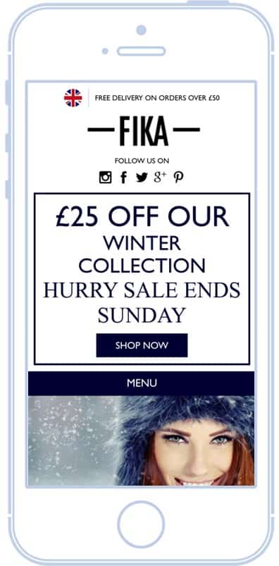
A typical email ready to be improved
Take this example of a fashion brand email. It has some really nice design elements, good selling points and provides a clear call to action. It’s also made up almost entirely of images.
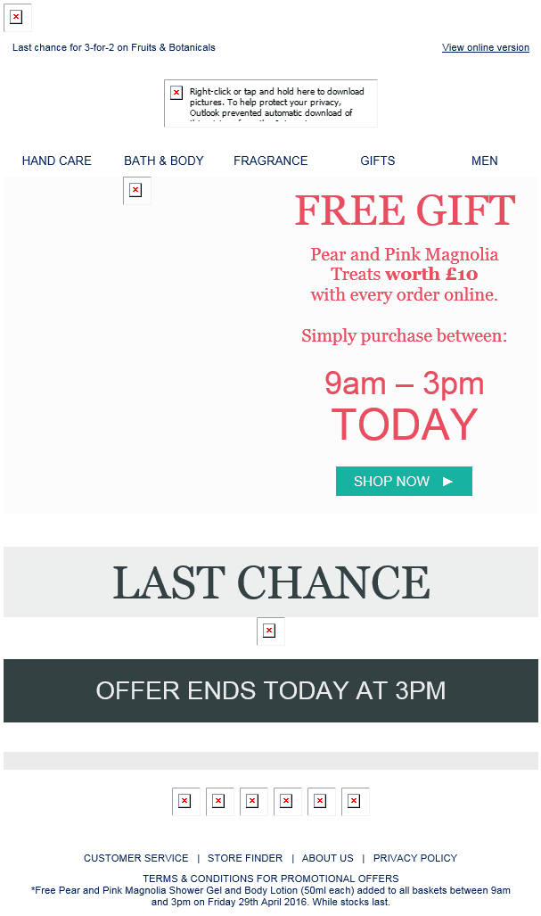
This means that, when viewed in Outlook, all you see is this:
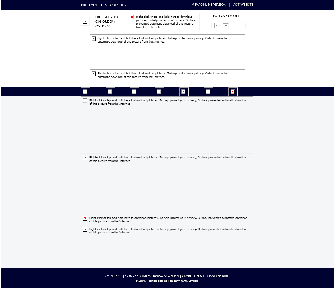
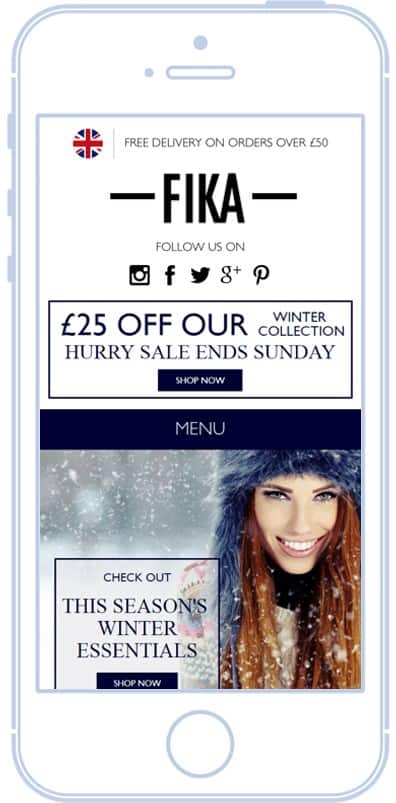
On mobile, although you can see the images by default, everything is reduced in size and difficult to make out. As customers, we don’t like this – we prefer to absorb content easily on our mobile phones without the inconvenience and hassle of zooming in.
How can you maintain your lovely design elements without relying on images alone?
The world of email is unforgiving – it doesn’t support all the advanced features that websites can, for instance:
- We have a limited set of web-safe fonts and CSS styles to choose from
- We have to build emails using tables – now considered a somewhat ancient coding structure in the world of web development
- We have rendering issues which differ across every email client. On top of this, not all email clients support certain tags and attributes so what works in Gmail doesn’t necessarily mean it will work in Outlook and vice versa.
But let’s not dwell on what we can’t do, let’s focus on what we can. We are able to use background images and, thanks to a nifty bit of code, we can even get them to work in Outlook! This means we can overlay text on top of images without the need to embed it in the image. The beauty of doing this, is that while we can still include an image, we don’t need to worry about losing the message inside it when images are switched off.
As for using a web-safe font, while it may not look identical to your brand’s, it’s guaranteed to work across all email clients and mobile devices. An alternative option is ‘Google Fonts’. There are hundreds to choose from, they’re free to use, and they even work on all Apple email clients, falling back to a web-safe font where not supported.
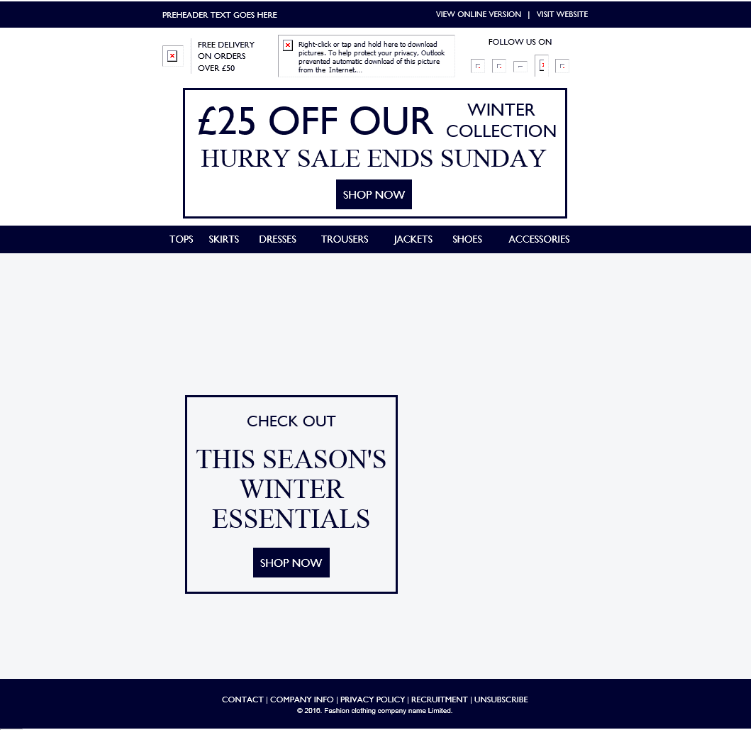
After transformation: applying best practice email design
Using the previous example, we’ll replace the banner style promotion at the top with text, and the main body of the email with a table using text overlaid on top of a background image. Turning off images in Outlook shows that, while not perfect, we are left at least with our promotional offer, main headline and call to action with no difficulty to understand the message.
When viewed on mobile, the image is still displayed, but the text is loud, clear and readable without the need to pinch and zoom in to see it.
Are background images the Holy Grail of email design?
Using background images, while a really elegant solution, is still not perfect. They are currently not supported in the Gmail app, which as you might know, tends to make its own rules when it comes to responsive design.
However, a mid-way solution is to make use of background colours. You can separate the image from the text, upload it as normal, and give the illusion that the text is still part of the image by finding the background colour which matches your image.
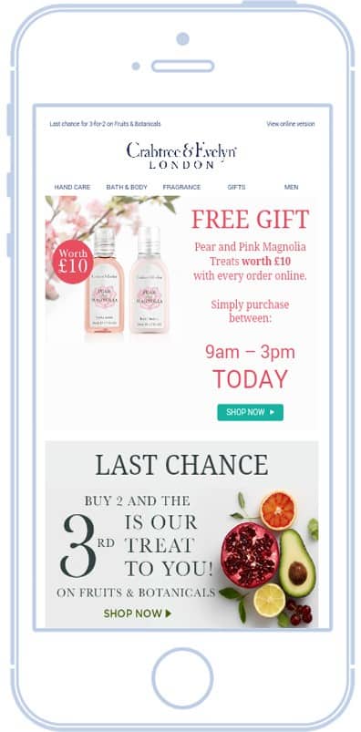
Here’s a really good real life example of how this works.
On the left we have the email displayed in Outlook with images switched off and on the right the email with images enabled. You can see how even when images are switched off, the message is still displayed loud and clear.

When viewed in the Gmail App, all the images appear alongside the message. As we don’t have full control over rendering in Gmail App, it can cause the layout of the email to appear differently from how we’d like it to. To get around this, we can force it to display the desktop version instead.
By using these techniques, you can create an email designed with the message front of mind and tailored to work across any email client or mobile device.
Now not even image blocking can stop your message from getting across to your audience!