
The first interaction your audience will have with your brand is most likely when visiting your website. Ensuring there is ample opportunity for them to receive future communications via email is key. Using a sign-up form to capture these email addresses is an easy first step, but if this process isn’t straightforward or clear, many of these contacts may be lost or put off.
Make sure the placement for the first sign up option is identifiable in a part of the homepage where little navigation is needed. Take a look at some of the examples below from brands that are getting it right:
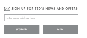
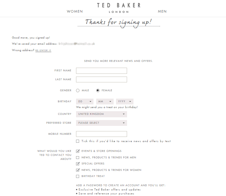
Ted Baker has a great tone of voice across their whole brand, portraying ‘Ted’ as your personal shopper. After entering an initial email address, you are greeted with a ‘Good move, you’ve signed up!’ message, highlighting how opting in for Ted Baker communications will be worth your while. The additional options on the form to collect preferences about store location, gender and birthday are presented as ‘one for you, one for me’. E.g. For every piece of data you give us, we’ll give you a reward or treat in return.
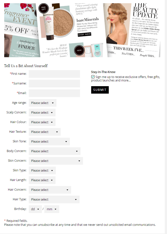
Feel Unique use a simple pop up sign-up form on their website asking only for the email address to begin with. This leads to a more elaborate form. Using statistics and customer feedback about your service is a great way to convince subscribers that they are part of a community once signing up (top left corner in the example below). By requesting information about the individual like their skin type or hair length, Feel Unique could send exceptionally targeted campaigns about skin type or hair colour, dependent on these preferences.
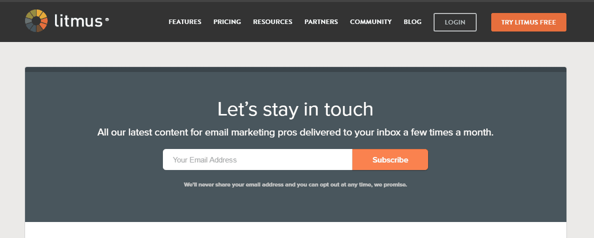
The Litmus newsletter is a great example of selling the benefits for signing up whilst keeping the process clean and simple. Just supply your email address and you will receive the latest updates that are relevant for Marketing pros, because you are a pro too.
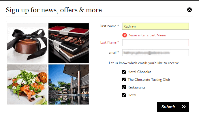
Hotel Chocolat has an email capture field on the footer of their website and once submitted, you are directed to this clean and minimalist form. It uses in-form validation to ensure a live email address and full name is entered before you can be added to their mailing list. Then, using tick boxes, the user can pick and choose which topics they want to receive emails on, ensuring Hotel Chocolat only send relevant content to those chocoholics.
Some key points to bear in mind
- Make it simple – don’t inundate subscribers with a lengthy sign up process. Start with a quick and clear sign up form to capture their email and then let contacts update their profile or give additional information when they’re ready.
- Tailor for your audience – depending on your brand, there may be specific information worth gathering at the point of sign up. A B2B newsletter wouldn’t ask a subscriber for their birthday but a retailer wanting to send birthday emails might, so only ask for what you really need.
- Incentivise – set the expectations and describe the benefits of signing up to their database, e.g. what are the perks of being a valued subscriber, are there any exclusive rewards or promotions only email subscribers will be notified of?
- Verification – use a form validation process to avoid inaccurate or miss-spelled email addresses being added to your lists, e.g. show an error message if the email address doesn’t exist, or highlight any required fields that have been missed.
- Make it timely – a confirmation welcome email off the back of the sign up is a quick win to confirm the contact has been added to the mailing list and start building a relationship. Try these welcome campaign examples for inspiration.